CSS gives you four easing keywords and then hands you cubic-bezier() with four numbers and no explanation. FindUtils Cubic Bezier Generator draws the curve, lets you drag its two control points, and replays the motion beside it.
This guide covers what the numbers mean, how overshoot is produced, and which curve belongs on which kind of motion.
What Do the Four Numbers Mean?
They are two control points, written cubic-bezier(x1, y1, x2, y2).
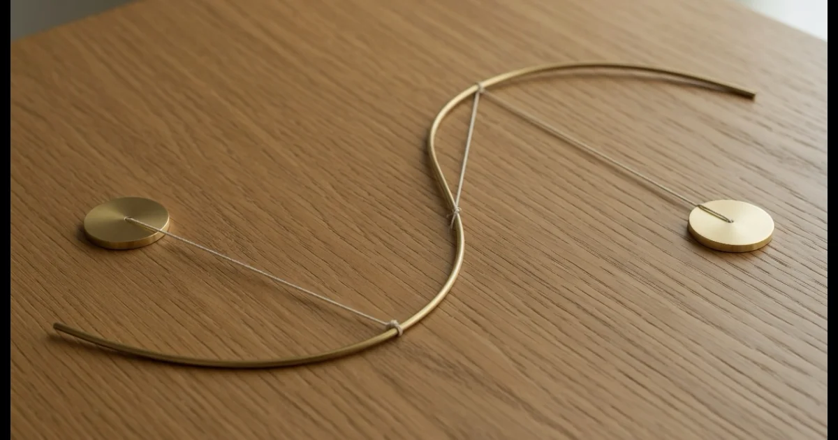
The curve always runs from (0,0) to (1,1). The horizontal axis is elapsed time and the vertical axis is progress, so the shape of the curve is literally the feel of the motion. Those two points bend it:
- The first point controls how the motion leaves the start.
- The second point controls how it arrives at the end.
A curve that rises steeply at first and flattens near the end starts fast and decelerates — that is ease-out. The reverse is ease-in.
The four keywords are just named points in this space:
| Keyword | Equivalent |
|---|---|
ease | cubic-bezier(0.25, 0.1, 0.25, 1) |
ease-in | cubic-bezier(0.42, 0, 1, 1) |
ease-out | cubic-bezier(0, 0, 0.58, 1) |
ease-in-out | cubic-bezier(0.42, 0, 0.58, 1) |
Why Can Y Go Past 1 but X Cannot?
Because X is time and Y is progress, and only one of them may run backwards.
X is clamped to 0–1. A control point outside that range would let the curve move backwards in time, which CSS does not permit.
Y is deliberately not clamped, and that is where the interesting curves live:
- Y above 1 produces overshoot — the value passes its target and settles back. This is how a spring-like motion is written without a physics library.
- Y below 0 produces anticipation — the element pulls back slightly before moving forward, the way a character crouches before jumping.
Neither is expressible with any keyword, which is the main reason to reach for cubic-bezier() at all.
Which Curve for Which Motion?
The rule that fixes most sluggish-feeling interfaces:
ease-outfor things arriving. Menus opening, modals appearing, cards entering. Fast start, gentle landing — it reads as responsive because the motion is already well underway when the eye finds it.ease-infor things leaving. Gentle start, quick exit.ease-in-outfor something that moves and returns, like an accordion.linearalmost never, except continuous rotation such as a spinner.
Using ease-in on an entrance is the single most common cause of motion that feels slow: the element barely moves for the first third of its duration.
Overshoot suits playful, physical interfaces and confirmations. It suits dense professional tools much less, and it looks broken on an element that hard-clips at its container edge — give it room, or keep the curve inside 0–1.
Does the Curve Matter More Than the Duration?
They fail differently. A duration that is too long feels like latency no curve can rescue. But at a sensible duration, the curve is what separates motion that feels designed from motion that feels mechanical.
Durations that hold up: 150–200ms for hovers and small state changes, 200–300ms for panels and modals, 300–500ms for anything crossing a large part of the screen. Above 500ms a UI animation starts to feel like waiting.
Because two similar-looking curves can feel very different at 200ms, judge them by the replay rather than by the shape on the grid.
Where Does the Value Go?
Anywhere a timing function is accepted — not just transitions:
.card { transition: transform 240ms cubic-bezier(0.34, 1.56, 0.64, 1); }

.toast { animation: slide-in 300ms cubic-bezier(0.34, 1.56, 0.64, 1) forwards; }
The generator copies either the whole declaration or the bare cubic-bezier() function, so it drops into an existing shorthand without editing.
One family it cannot express: steps(), which jumps rather than curves. Write that by hand when you want a frame-by-frame effect.
Is Anything Uploaded?
No. The curve exists only in your browser. The page itself loads advertising and analytics scripts like the rest of the site.
Common Mistakes
Mistake 1: ease-in on an Entrance
It makes arrivals feel slow. Use ease-out for anything coming in.
Mistake 2: Overshoot on a Clipped Element
If the container hides overflow, the overshoot is cut off and looks like a glitch.
Mistake 3: Judging the Curve by Its Shape
Two similar curves feel different at 200ms. Watch the replay.
Mistake 4: Expecting steps() From a Bezier
Different family. Two control points cannot produce a jump.
Mistake 5: Fixing Feel by Lengthening Duration
Slow motion is usually the wrong curve, not too little time.
Tools Used in This Guide
- Cubic Bezier Generator — Drag the control points, replay the motion
- CSS Animation Generator — Build the keyframes this curve drives
- SVG Animation Generator — Animate paths and shapes
- Border Radius Generator — Shape the element being animated
- Lottie Editor — When motion outgrows CSS
FAQ
Q1: Is the cubic bezier generator free? A: Yes. No signup, no limits, and the curve is built in your browser.
Q2: What do the four numbers in cubic-bezier() mean? A: They are two control points as x1, y1, x2, y2. The curve runs from (0,0) to (1,1); those points bend it. X is time, Y is progress.
Q3: How do I make a springy motion? A: Drag the second control point above the top line so its Y value exceeds 1. The value overshoots its target and settles back.
Q4: Why can't I drag a handle outside the box horizontally? A: X is clamped to 0–1 because a value outside that range would move the animation backwards in time, which CSS does not allow. Y is intentionally free.
Q5: Can I use the value for animations as well as transitions?
A: Yes. It works in animation-timing-function and the animation shorthand as well as transition-timing-function.
Q6: What is the difference between ease and ease-in-out?
A: Both start and end gently, but ease is asymmetric — it accelerates faster at the start and spends longer decelerating. ease-in-out is symmetric.
Next Steps
- Build the keyframes in the CSS Animation Generator.
- Animating a shape instead? Use the SVG Animation Generator.
- Beyond CSS? The Lottie Editor handles richer motion.