Glassmorphism is a frosted panel that blurs whatever sits behind it, and in CSS it is four properties that only produce the effect together. FindUtils Glassmorphism CSS Generator previews the panel live and gives you the copy-ready declaration.
This guide covers what the effect actually needs, what it costs in performance, and the readability problem that sinks most first attempts.
What Makes a Glass Panel?
Four properties, none of which works alone.
.glass {
  background: rgba(255, 255, 255, 0.15);
  backdrop-filter: blur(12px);
  border: 1px solid rgba(255, 255, 255, 0.25);
  border-radius: 16px;
}
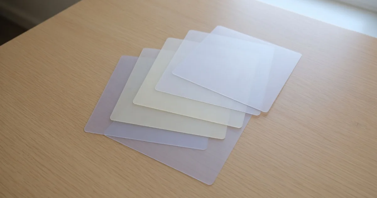
- A translucent background. Fully opaque and there is nothing to see through; fully transparent and there is no panel.
backdrop-filter: blur(). The property that does the work: it blurs the content behind the element rather than the element itself.- A light hairline border. This is what reads as a glass edge catching light. Without it the panel looks like a smudge.
- A radius. Glass panels in this style are always rounded; a sharp-cornered one reads as a plain overlay.
The most common mistake is reaching for filter: blur() instead of backdrop-filter. filter blurs the element and its own text into illegibility. backdrop-filter blurs what is behind it and leaves the contents sharp.
Why Does the Effect Do Nothing on My Page?
Because there is nothing behind it to blur. This is by far the most frequent report, and it is almost never a browser problem.
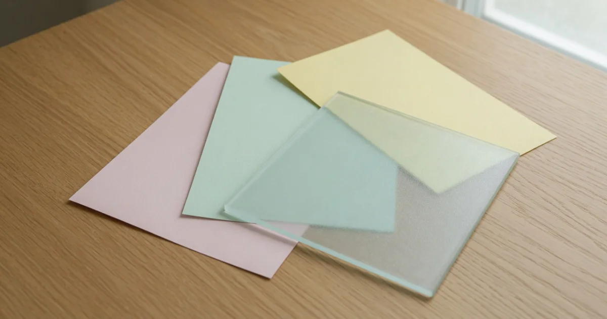
backdrop-filter samples the backdrop. On a flat white page the blurred version of white is white, so the panel looks like a plain translucent box. The effect needs visual complexity underneath: a photograph, a mesh or multi-stop gradient, or overlapping shapes.
Two other causes worth checking:
- The parent has
overflow: hiddenplus its own stacking context, which can clip the backdrop sampling. - A parent has
filterapplied, which creates a containing block that changes what the backdrop is.
What Does It Cost in Performance?
More than most CSS. A backdrop blur forces the browser to sample and blur a region of the composited page on every frame where anything behind it moves.
Practical limits:
- Keep the count low. A few panels are fine; twenty in a scrolling list will drop frames on mid-range hardware.
- Avoid animating the blur radius. Animating
backdrop-filterre-renders the blur each frame. Animate opacity or transform instead. - Watch it over video. A glass panel over playing video is the most expensive combination available.
- Blur radius has diminishing returns. Past roughly 20px the look barely changes and the cost keeps rising.
Browser support is now broad, but a fallback still matters: without backdrop-filter, a 15% white background over a photo is nearly unreadable. Use @supports:
.glass { background: rgba(255, 255, 255, 0.85); }

@supports (backdrop-filter: blur(12px)) {
  .glass {
    background: rgba(255, 255, 255, 0.15);
    backdrop-filter: blur(12px);
  }
}
The fallback is the opaque version. That ordering means an unsupported browser gets something readable rather than something broken.
How Do You Keep the Text Readable?
By treating contrast as a measurement, not an impression.
A glass panel puts text over a background that changes as the page scrolls. Text that is comfortable over the blurred sky is unreadable over the blurred building. The fixes that work:
- Raise the background opacity. 15% looks best and 25–35% is usually what ships.
- Add a subtle dark layer under light text, via a second background layer or a gradient.
- Increase the blur. More blur means less structure behind the text, which means fewer local contrast failures.
- Measure it. Check the text colour against the lightest and darkest points of the backdrop with the Contrast Checker. If it fails either, it fails.
Is Anything Uploaded?
No. The preview and the CSS are produced in your browser. The page itself loads advertising and analytics scripts like the rest of the site.
Common Mistakes
Mistake 1: Using filter Instead of backdrop-filter
filter: blur() blurs the panel and its text. backdrop-filter blurs what is behind it.
Mistake 2: Putting Glass on a Flat Background
There is nothing to blur. Add a photo, a gradient or shapes underneath.
Mistake 3: No @supports Fallback
Without one, unsupported browsers show a 15% white box over a photograph, which no one can read.
Mistake 4: Animating the Blur
Animate transform or opacity. Animating the blur radius re-renders it every frame.
Mistake 5: Assuming It Passes Contrast
Measure against the extremes of the backdrop, not the average.
Tools Used in This Guide
- Glassmorphism CSS Generator — Blur, transparency, border, live preview
- Gradient Generator — Build the backdrop the effect needs
- Contrast Checker — Measure the text against the backdrop extremes
- Border Radius Generator — Tune the corner curve
- Box Shadow Generator — Lift the panel off its background
FAQ
Q1: Is the glassmorphism generator free? A: Yes. No signup, no limits, and the CSS is generated in your browser.
Q2: What browsers support backdrop-filter?
A: All current major browsers. Ship an opaque @supports fallback anyway, because the unsupported result is unreadable rather than merely plain.
Q3: Why does my glass panel look like a plain grey box? A: There is nothing behind it with enough structure to blur. Put a photograph or a multi-stop gradient underneath.
Q4: Does glassmorphism hurt performance? A: It is one of the more expensive CSS effects. A handful of panels is fine; many panels in a scrolling list, or a panel over video, will cost frames.
Q5: How much blur should I use? A: Between 8px and 16px for most panels. Past about 20px the appearance changes little while the cost keeps rising.
Q6: Is it accessible? A: Only if you make it so. The backdrop varies, so measure your text against both the lightest and darkest areas behind the panel.
Next Steps
- Build the backdrop first with the Gradient Generator.
- Measure the text with the Contrast Checker.
- Tune the corners with the Border Radius Generator.