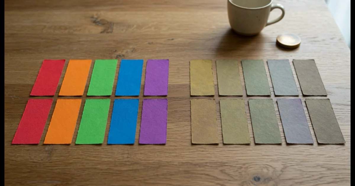
Roughly one in twelve men and one in two hundred women has some form of colour vision deficiency, and the most common kinds compress red and green towards the same yellow-brown. FindUtils Color Blindness Simulator renders your palette — or a screenshot of the real interface — the way those readers see it, in the browser.
This guide covers what each deficiency does, how to read the result, and the important thing the tool deliberately does not claim.
What Do the Four Types Actually Change?
Each is a missing or absent cone response, not an absence of colour.
| Type | Missing | Effect | Roughly |
|---|---|---|---|
| Deuteranopia | Medium (green) cones | Red and green flatten towards yellow-brown | Most common |
| Protanopia | Long (red) cones | Similar, with reds also darker | Common |
| Tritanopia | Short (blue) cones | Blue and green confuse; yellow washes out | Rare |
| Achromatopsia | All colour | Luminance only | Very rare |
If you check one strip, check deuteranopia. It is the most common form and it flattens exactly the red-green distinction that interfaces lean on hardest: success green against error red.
The achromatopsia strip earns its place for a second reason — it is a good proxy for how the palette survives a black and white printout.
How Do You Read the Result?
Look for two swatches that become the same colour. That pair is the problem.
Two colours that stay visibly distinct in all four strips are safe to use as the only difference between two things. A pair that converges needs a second signal. In order of reliability:
- Separate them by lightness, not hue. This is the single most effective fix, and it helps in greyscale printing too.
- Add a non-colour carrier. A label, an icon, a dashed versus solid line, a pattern fill, a position.
- Change one of the colours to something further away in hue and lightness.
The classic failures are worth knowing before you test: red/green chart series, a form that marks errors only by turning a border red, a status badge where green means healthy, and a red-to-green heat scale whose middle disappears entirely.
Why Test a Screenshot as Well as the Palette?
Because a palette can survive in isolation and still fail in place.
Five swatches at 80px square are far easier to tell apart than the same colours as 1px borders, 14px text, or thin chart lines on a busy background. Loading an actual screenshot shows the colours at the size and against the surroundings they will really have. The image is read from your device and processed in a canvas in the tab; it is never uploaded.
What This Does Not Tell You
It does not tell you whether anything passes an accessibility standard, and it does not claim to.
This is worth being blunt about, because plenty of tools blur the line. A simulation shows how colours may appear. Accessibility standards are about contrast, which is a measured ratio between two specific colours. The two questions are different:
- Are these two colours confusable? → this simulator.
- Is this text legible on this background? → the Contrast Checker, which reports a ratio against WCAG AA and AAA.
A palette can be perfectly distinguishable under every deficiency here and still fail contrast badly. Both checks are worth running, and neither substitutes for the other.
The matrices used are the standard approximations for the dichromacies. They are good enough to reveal confusable pairs. They are not a medical model, they do not cover anomalous trichromacy — the milder and more common case where a cone is shifted rather than missing — and individual vision varies.
Common Mistakes
Mistake 1: Treating the Simulation as a Pass or Fail
It has no pass or fail. Use the Contrast Checker for a measured result.
Mistake 2: Only Checking the Palette
Test a real screenshot too. Size and surroundings change everything.
Mistake 3: Fixing by Changing Hue Only
Two different hues at the same lightness can still merge. Move the lightness.
Mistake 4: Leaving Colour as the Only Signal
Add an icon, a label or a pattern so the meaning survives without colour at all.
Mistake 5: Assuming It Covers Every Reader
These are the dichromacies. Anomalous trichromacy is more common and sits between normal vision and these strips.
Tools Used in This Guide
- Color Blindness Simulator — Four deficiencies, palette or screenshot
- Contrast Checker — The measured WCAG ratio
- Color Palette Generator — Build the palette you are testing
- Color Converter — Adjust lightness in HSL
- Image Color Extractor — Pull the colours out of an existing screen
FAQ
Q1: Does this tell me if my colours are accessible? A: No, and it does not claim to. It shows how colours may appear under four deficiencies. Accessibility standards measure contrast ratios — use the Contrast Checker for a pass or fail.
Q2: Which deficiency should I check first? A: Deuteranopia. It is the most common and it flattens the red-green distinction most interfaces depend on.
Q3: How accurate is it? A: It uses the standard matrix approximations for the dichromacies, which reliably reveal confusable pairs. It is not a medical model and does not cover anomalous trichromacy.
Q4: Is my screenshot uploaded? A: No. The image is read from your device and processed in a canvas in the tab. The page loads ads and analytics like the rest of the site; your image is not part of that.
Q5: Two of my colours merge — what now? A: Change one colour's lightness rather than its hue, and add a second non-colour signal such as an icon, label or pattern.
Q6: Why does the achromatopsia strip look like greyscale? A: Because it is a luminance conversion, which approximates a complete absence of colour perception. It doubles as a black and white print preview.
Next Steps
- Measure the pairs you will use with the Contrast Checker.
- Rebuild the palette with the Color Palette Generator.
- Adjust lightness precisely in the Color Converter.